The new version of Bingo Card Creator is up and open to the world now. It features a massive integration with Daily Bingo Cards (no link since the site is, well, integrated) and a spiffy new design. I’d like to talk a bit about why I did that, how I got it done, and my reflections on the process.
Why:
I really lack design skills. Sure, I can edit HTML and modify CSS if given a template to work with, but visually I’m just totally lost. Ask my coworkers — I can fail to match colors given a closet full of white shirts and black pants. While the open source Sunny design by Sangent kept me going for a ridiculous amount of time, I had always been not-wowed by the brown text, and the HTML was getting far too crufy to use in a dynamic site and to modify quickly and easily. You’d be *amazed* at the challenges in keeping the right hand sidebar in a pretty position, for example. (My fault, obviously, not his.)
Sadly I did not keep a photo diary of the website to show you how much, or how little, it has changed over the years. Ah well.
You’ve Got Talent, I’ve Got Money, Lets Party!
One of the main things I appreciated with the OSS web design I used was that it fit my budget (um, nothing) when I was starting with that $60 constraint back in the day. After 1.5 years of growth, though, Bingo Card Creator throws off enough cash so that I can comfortably smooth over my weak points by hiring people with talent to fill them. This worked so exceptionally well for me for getting bingo cards written (total cost: approaching $500 and worth every penny) that I was fairly confident on doing it for web design. One catch: I only know one web designer, and he was a little busy this month.
Enter eLance. It is essentially a Rentacoder-type site with a) a much, much better interface and b) a wide collection of Internet professionals probably a little more biased towards web design. I wrote up what I wanted, mentioned my price range was sub $500 (mentally I was thinking $300 – $500 based on expected quality), and started soliciting bids.
Here’s the project description. Note I tried to make things as easy as possible for the designer. This was both to tell folks which types of designers I wanted bidding, and also to signal to designers “This is not a client who is going to suck your time and be terrible to work with”.
What I need done:
I am a business owner and web programmer. My artistic and design skills, however, are limited. I am planning on merging two of my websites in an education-related niche, and will be using the merge as an opportunity to improve the current graphical designs (which are based on very generic looking open source templates, and do not mesh well at all).
All I need done is the CSS, HTML, and assorted graphics files for one page to use as a template — I am capable of porting the template to the rest of the site by myself.
What I already have versus what you will build:
I have two functioning websites for you to work off of, including the page whose content you will be using to design the template. I will also provide you with a design document identifying features which I will need in the template — target resolution, number of columns, and the like. You get to take the existing content plus the design document and turn it into something pretty. I have also got a logo which you can incorporate into the site, or not — I’ll leave that one up to your discretion.
Style notes:
The overwhelming majority of my users are non-technical females in their 30s and 40s. The website needs to have a clean, inviting, and bright feel to it. I rather like the artistic direction of most Web 2.0 sites, if you need general inspiration — simplicity, curves, etc. If you’ve got a portfolio of sites like that, you’re more likely to get my business. What I do *not* need is a generic-looking template with a stock photo on it.
Technical notes:
For SEO purposes and to ease my integration job, I’m going to need the CSS externalized, the layout to be done primarily in CSS rather than in tables, and the code to look very clean.
Timeframe:
I’d like to have this done within 2 weeks, which is quite generous for the amount of work I expect this to require.
I started to get a lot of bids, most extraordinarily low from countries with low prevailing wages. Many of their portfolios were filled with… websites of a quality which I would not aspire to? Most of the bids were also copy&paste templates which gave absolutely no indication that they had actually read more than a sentence of my proposal. Here is a fairly typical one, with some edits for anonymity.
We are team of professionals having expertise in developing web based application using PHP/ASP and Cold fusion and in web designing using Photoshop, Dreamweaver,Illustrator,Flash 8.0/Flex & Maya. After reading your project description, we are highly interested to do this CSS page for you. [Note this first and most crucial paragraph tells me nothing of use, other than they understood the word CSS.]
Here are some of the reference websites designed by us recently.
[Snip of websites, none of which look remotely like anything in my niche, inviting to ladies, etc.]
We can carry on with your work for 100 USD where in we will design this page exactly as per your requirements using CSS. Kindly revert back incase you need for information from us. Thanks!! Bob
One proposal, however, stood out:
Hello and thanks for the opportunity to bid on your project. I understand your requirement for a clean, web 2.0 style professional layout and can deliver precisely the same. I can deliver a high-impact template incorporating pleasant colors, ease of navigation and a look that would not tend to bore prospective visitors, even on multiple visits. [Holy cow, a designer who talks about design and not tools. Pinch me.]
I have over 9 years of experience working on CSS layouts and can assist you better as I am a woman myself. [She read the spec!] If you can give me the links to your current websites as well as a summary on what you expect the new design to do for you, [she knows she needs more information and is unafraid to ask before promising the moon!] I am willing to do a FREE sample design for you to consider before you may chose my bid or any other.
Feel free to see my portfolio -http://www.gursimran.com [take a look — the portfolio page itself sold me]
Thanks & Regards,
Gursimran
I was at this point 95% convinced I would choose Gursimran, based on the quality of her letter and portfolio. However, she had offered to do a free design, so I decided to take her up on it. After giving her my requirements spiel, this is what she came up with:
Hello again Patrick,
Please find attached [warning: huge image, new window] the mockup I did for you.
What I have tried to achieve with this design:
1) Integrate web 2.0 elements like soft gradients, visible text and bright choice of colors for ease of navigation and a clearer message.
2) A layout completely achievable with the use of pure CSS and with excellent flexibility as well as editable text everywhere for easy updates.
3) Individual header images which use text as their headings (editable via html) enhancing the message as well as giving a professional outlook.
4) Well spaced out elements to give a lot of open feel and ease of navigation.
5) Use of red and yellow from the logo balanced with gray elements to give subtle yet effective direction to the layout.
I do look forward to your comments.
Everything in this layout is built from scratch (except for the logo) – so feel free to ask for any modifications on the same. My goal has been to keep it simple but effective – do let me know if you prefer it any other way.
Thanks for your consideration,
Regards,
Gursimran
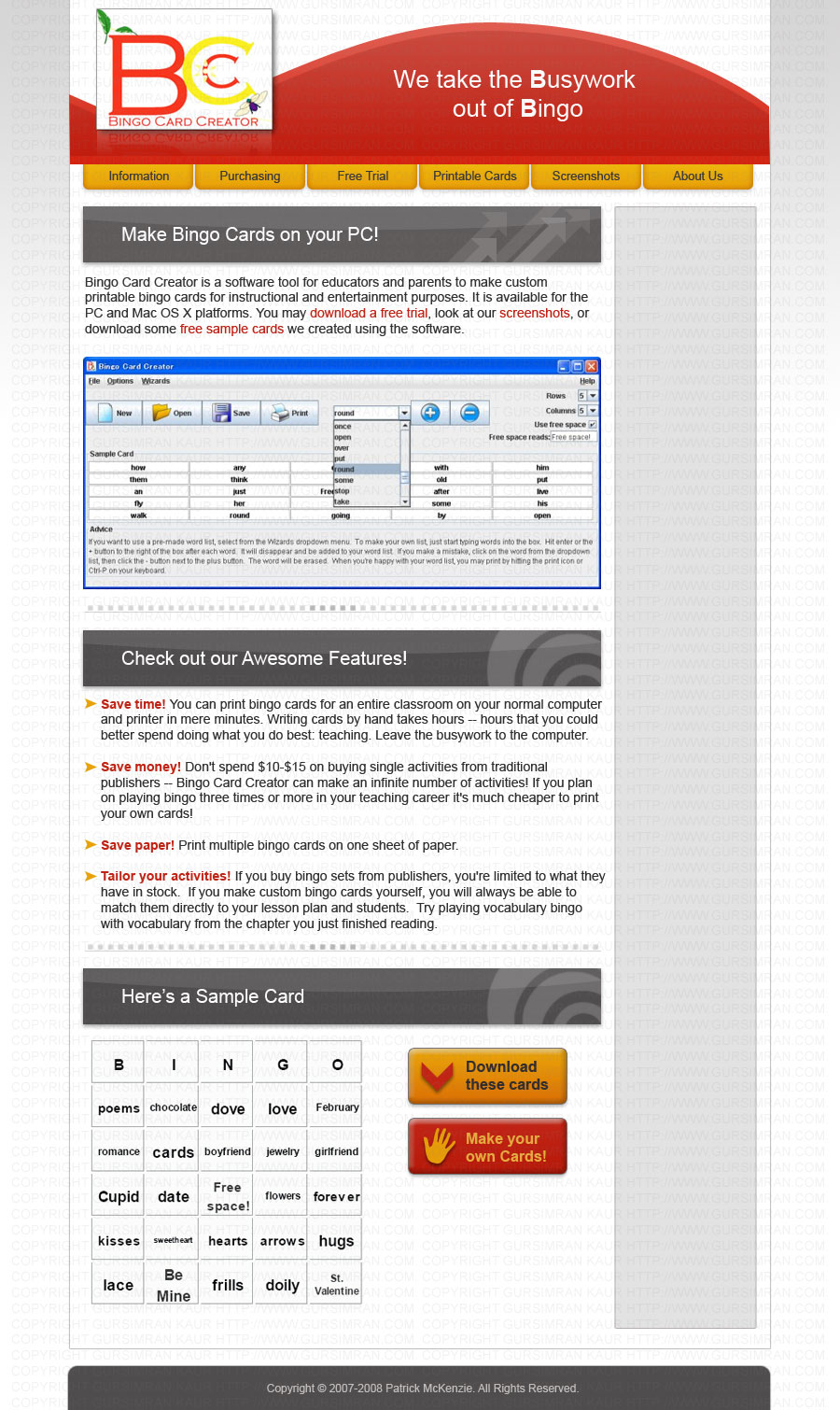
Its clean. Its web 2.0. Its beautiful. It is also colored blood red, firey orange, and black. OK, clearly we need a bit of work on the color scheme, but this makes me 100% certain that I’m going with Gursimran. We then go through a few iterations on color — I keep saying variations on “bright” and “pastel”, and some of her options were closer than others. Not being totally happy with any of them, I looked through her portfolio (the online equivalent of paint swatches), and said “I really like the blues you have here” (her personal blog).
Concurrently with the color scheme selection, we work on button designs. Funny thing about icons — if you don’t know a bit of trivia about the cultural background of the audience, you just might make your Download Now button look like a stopsign:
![]()
So I told Gursimran that red + hand displayed palm up does not mean “You’re cordially invited to download this software” in America, and suggested some improvements to make things more inviting. The next version was much improved:

(Note: not using those on the website at the moment, but I probably will later after some tweaks to them.)
Then I got a bit of touchup work done on the line wrapping, and voila, one completed website. I quickly mailed Gursimran back thanking her for the design, and released her payment. A glitch on eLance’s side caused me to be refunded five minutes before releasing the payment, so I had to send it again, but other than that things went off without a hitch.
The End is Only the Beginning
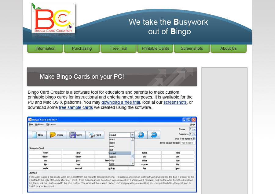
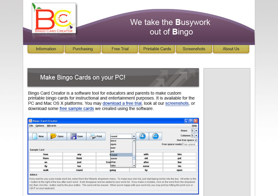
I was largely satisfied with that design — not quite feeling the dark green, but otherwise it was worlds better than what I could accomplish by myself. Feedback from my professional peers was also largely positive. Then I started to integrate it with my sites, and found that a few points were a little brittle. For example, if you had sidebar items which were 2+ lines long, they’d overflow the image designed to hold them. Uh oh, not good when you need to write things like “Canadian Provinces Territories And Their Capitals Bingo Cards” (longest one on the site at present, by the way).
And I really didn’t like that green. So I busted out Stylizer (highly recommended, and a uISV product to boot), replaced the image background with a plain HTML color, and then used their extremely intuitive color selector to find a green that I liked. Then I noted its HTML value, opened up the old image in Paint.NET, used the magic select button to grab all of that wedge Gursimran had nicely drawn for me, and flood-filled it. This gave me solid green, but solid green was a little much, so I played with a bit of a gradient to white until I found a look that I liked. Then I went back to Stylizer, changed the text from black to white (which makes it look a whole lot less dark), and changed the rollover color to blue so it would be visible.
Now, what to do about the sidebar? Well, I decided to go all text labels on the sidebar for consistency, and made them green because otherwise the navigation bar would be the only green thing on the site, and looking at it was making me feel blue. (Bad puns like this are an English teacher’s stock in trade.)
Twelve hours of HTML editing and Rails wizardry later (30 templates to alter, gack), the site is looking better than it ever has and will now be MUCH easier for me to update in the future. It also has some functionality improvements which I’ll talk about later.
Suggestions for outsourcing
-
Get ready to be flooded by a bunch of low-quality, copy/paste proposals on the freelancer. Ignore them, and focus on finding the diamonds in the dust.
-
The more specific your proposal is, the better informed your designer will be and the more likely you’ll attract a quality designer (who, naturally, want quality clients). Gursimran commented that I was one of the best clients she ever worked with, and she is certainly the best designer I’ve ever worked with, which is sincere praise even with a sample size of 1.
-
English is funny sometimes. Examples you can point to sometimes help a lot more than our limited design vocabulary, especially when you’re an engineer and your design vocabulary contains only the words “pretty” and “not pretty”.
-
For God’s sake, look at the portfolio before accepting a bid. You might not get designs as stunning as the portfolio, but you certainly aren’t going to get better, and about 50% of portfolios disqualify designers straightaway.
Anyhow, next time I need something done, I’m shortcircuiting this process and bringing work straight to Gursimran. I recommend her to any uISV needing a quality design done in a visual style similar to what she usually produces. Please don’t make her so busy that she can’t work on my sidebar buttons.
Minor nuisances
Communication and length of time it took to get the design done (two weeks and change) were more problematic than it would have been if I had had face-to-face contact with the designer. However, I was in no particular hurry.
Next Step
I’m getting a new logo designed to match the new look. Expect my report of that next weekend. There are also a million and one little tweaks to do to the new site. If you’ve got comments, I’d love to hear them.
Standard Disclaimer:
I have never accepted payment for plugging service providers and won’t start anytime soon. Gursimran graciously consented to be written up for this blog post.
