Today after reading a thread or three and watching a Google-produced movie about landing page optimization (over an hour long and worth your time) I was inspired to make some changes to my site. Recently I have been doing far more development than A/B testing, and truth be known I don’t really, um, know how my funnel is working these days. So I went back into the archives of my CrazyEgg tests and looked around to see if there was anything that jumped out at me. The fresh look caused me to pick up on a few things:
Plug Your Leaking Funnel
If you’ve ever read anything about conversion optimization you’ve heard the funnel metaphor : the steps towards buying can be thought of as a funnel, where a lot of people come in at the top and as they move forward you see less and less people until a mere trickle actually succeed in giving you money. You want your funnel to avoid leakage, to the maximum extent possible.
Bingo Card Creator has a fairly typical funnel:
Prospect sees me in search engine or ad -> Prospect clicks to homepage -> Prospect downloads trial (or signs up for online trial) -> Prospect plays around with trial -> Prospect likes what they see -> Prospect clicks on purchasing page -> Prospect interacts with shopping cart -> Prospect gets redirected to Paypal or Google Checkout -> Prospect fills out form -> I get money.
Yikes, saying it like that makes it sound even longer than it actually is. Anyhow, every step is crucial because the effects are multiplicative: a 5% improvement anywhere essentially results in 5% straight to the bottom line. (Hat tip to Steve Pavlina for this insight, which is probably one of the three most important things I know about selling software.)
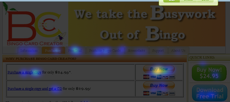
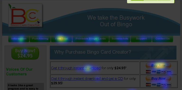
Anyhow, I picked a step in the funnel where I see a lot of dieoff, the purchasing page, and took a gander to see if there were any obvious ways to improve it. Looking at several experiments in CrazyEgg, which I collected over the course of the last few years, something jumped out at me. See if you can spot it in these heat maps:
Early 2007:
Early 2008:
Early 2009:

Did you spot it?
Far too many users interact with the main navigation bar to go backwards in the funnel. Despite the fact that the overwhelming majority of people on this page are here because they are satisfied users of the free trial and are seriously considering giving me money, the Free Trial and Printable Bingo Cards buttons capture almost as many clicks as any other element on the page.
I love giving users free things that make them happy, but there is a time and place for it, and that time and place is not right in the middle of me asking them for money. So I eliminated the distracting free options (and, while I was at it, the redundant purchasing option):

(You’ll note, by the way, that a lot of online retailers take a weedwacker to their entire navigation system when you’re getting into the purchase funnel. Check out how much cruft Amazon cuts out next time you checkout there.)
Don’t Violate User Expectations
As an engineer I love elegance… probably to a fault. For example, I always wanted to have exactly the same top-level navigation on all my pages. This resulted in having a button to the home page actually on the home page. OK, perhaps that wouldn’t be the worst thing in the world — except in a fit of stupidity way back in 2006 I titled that button “Information”, and despite four people telling me “You know, people seeing a button titled Information will click it thinking that it offers Information and will get upset when it just causes their screen to blink”, I never got around to changing that.
Sell What You Sell
Recently I released an online version of Bingo Card Creator, which I strongly hope will increase my sales substantially by decreasing the funnel dropout associated with downloading and installing BCC. However, my site is still largely written to promote the downloadable version… to an almost painful degree sometimes. For example, if you were to click on the purchasing link from within the upsell in the free trial of the online version, you’d find:

(Incidentally, that phrasing used to be “Purchase a single copy for only $24.95″. I changed it at the suggestion of Aaron Wall, to emphasize the benefit — you get what you want instantly — over the action. I think that sentence has been worth over a thousand bucks.)
However, when you’re selling something which is specifically designed to avoid the hassles associated with being downloaded, offering instant download is perhaps not the best idea! So I rewrote it again to be a bit more neutral among my products:

If I had an absolutely infinite development budget I’d code up one version of the site to only sell the online version, one to sell both, and one to sell only the downloadable version, and then start split testing like a madman. However, that is just not in the cards in the near future. If I have some time later I’ll consider rewriting this page for people who are logged into the online version, though.
Optimizing Offsite Payment Processors
If you’re a member of SEOBook and have not yet read leeds’ post “Great conversion tactic for you”, do so now and implement the suggestion it makes immediately. (He asked me not to repeat the advice publicly. I’m going to respect his wishes on that one.)
However, it did get the creative juices flowing:
Usual Disclaimer
I have confidence that the above examples are good ideas but confidence loses to evidence every day and twice on Sunday. Conversion optimization is a science, not black magic: test, test, and test again to see what works in your particular market and circumstances.
Disclaimer: I am a moderator at SEOBook, but am not compensated for plugging it. That said, it costs about $100 a month and I made that back on the first bit of advice I got. It gets my two thumbs up. CrazyEgg would require minimally an extra seven thumbs to express how awesome it is for visualizing user behavior — see the above heat maps.
If you found this post interesting, you may like my other posts about web design, conversion optimization, and the like. (I don’t mean design in the sense of pretty things: I have all the artistic skill of a blind mole rat.) Also, try searching the blog for “conversion rate” and the like, there have probably been a few posts which escaped my uneven categorization efforts.