Recently, I finally got around to making a proper landing page for Bingo Card Creator. It has been fairly successful for me so far, increasing conversions markedly (my historical average for AdWords is about 18%, that page converts at about 28%) and decreasing my cost per conversion.
Here’s what I think I did right:
Focus On A Single Goal
The stock Bingo Card Creator homepage, which has been the landing page for all of my advertising since time immemorial, has to serve a lot of purposes at once. It signs people up for the trial. It drives people to the download. It sells the benefits of Bingo Card Creator. It provides an entry-way into support. It lets people log in. It funnels around link juice for SEO purposes. It, like the prototypical uISV, wears fourty-seven hats.
Landing pages should have one goal. My new one aims to capture a sign-up to the trial of the online version of the software. That is it.
To accomplish this:
- Strip out all navigation which conflicts with The One True Goal.
- Eliminate visual distractions from The One True Goal.
- Make it absolutely, blazingly visually obvious what The One True Goal is.
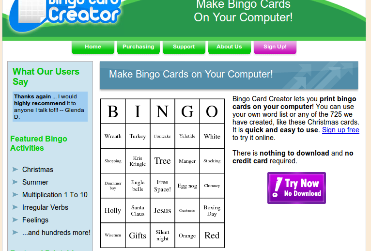
If you guessed that the goal for the page is clicking either the giant purple button or the single visible hyperlink, you win!
Include Trust Markers
Bob Walsh has gone over this a million times referring to his MicroISV Sites that Sell book: testimonials work. I have never really used them to their full potential, but I have diligently collected a little notebook (with permission, naturally) from my 1,800-odd customers. This gives me a bit of a palette to work with. While normally I personally prefer hitting customers with a few testimonials at a time, like this wonderful example, I didn’t have too much space to work with. So I picked a single testimonial, lightly edited for length and content, and bolded the important bits.
I cannot stress enough how much people do not read on the Internet. Accordingly, if you want to maximize your sales, you should adapt to users that:
- skim more than they read
- feel more than they think
- enjoy bad self-referential humor (OK, this one is optional).
Seriously speaking: bold the bits of the testimonials which sell your software. Cut the bits that don’t, as long as you can do so without making the testimonial say something the customer did not. They are not professional marketers and should not be expected to write like them. You are, so give them a minor hand. (Polishing it until it is too good is another danger. Testimonials should remain authentic.)
It should go without saying but in addition to reflecting on you, a testimonial reflects on your customer. Even if you are making them largely anonymous, extend them the courtesy of copy edits to make their words suitable for public distribution. If I never see [sic] in a testimonial again it will be too soon.
Don’t Forget the Guarantee
I don’t feel like elaborating on this, other than to say I once walked out the door without pants on. That is a pretty serious oversight, but it still isn’t as bad as forgetting your trusty money-back guarantee.
Address Your Shadow Audience
Google likes to see certain things on landing pages and hates to see others. You really don’t want to tick them off. Most of my readers are honest businessmen, which automatically saves you a lot of the headaches, but there are a few subtleties:
- Trust markers like a privacy policy, return policy, etc go a long way.
- Don’t look like an affiliate. Google is very ambivalent about affiliates — they make billions off of them, but to the maximum extent possible Google would rather disintermediate the affiliate, because they feel that a) it provides a better customer experience and b) Google should be getting the money the affiliate does.
- Landing pages have a tendency to repeat large swathes of text, which could cause duplicate content problems for your site. This is particularly acute if you build them on an industrial scale (about which I will have more to say later). Save yourself some pain and either exclude your landing pages from the index using robots.txt or include the following code in your header somewhere:
<meta name="googlebot" content="noindex, noarchive, nosnippet">
Technically speaking there are more search engines than Google to worry about. Hah. Sorry, where was I.
Provide Continuity
Marketers sometimes say “information scent”, but I like continuity: seeing your ad, clicking on your ad, reading your landing page, and then interaction with The One True Goal should be one continuous flow, free of jarring transitions and mental static. For example, you should have your ad call to action anticipate the call to action text on your landing page. Thus:
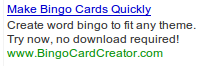 Notice how I’m focused on the proposition of “quickly”, with the call to action “Try now, no download required!”
That matches my call to action on the landing page:

This means that for a large portion of my visitors, I get the click to the purple “for free” : they’re already mentally invested in trying now, no download required. That is why they came here. So I don’t have to convince them so much with the other text on the page.
Of course, that doesn’t help much if I lose them at the signup form. Candidly, my signup form could use some work — it performs much, much better than my download/install rigamarole ever did, but it severely needs a graphical upgrade and some interaction design TLC. However, there is one trick to it that I’m fairly happy about. I’ll share that with you guys this weekend, as it is a little subtle and I want to collect a few more days of data to show you that it actually works.
Preview of coming attractions: I have often said that paying a freelancer to write content for my website was probably my best ROI ever. This resulted in over 700 pages which are very responsive to exactly what searchers want. What if it had also resulted in 700 ads?