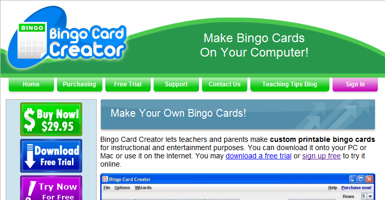
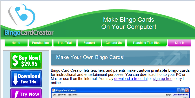
Some months ago when the 99designs fixed-price logo store launched, my buddy Thomas at Matasano remarked that it would have been the perfect choice for my business. I said that, while I’m quite impressed with 99designs’ business model and many of the logos on offer, I thought the less-generic-looking logo which I had custom-made fairly cheaply (by the folks at Logo Samurai — I bought three logos and chucked the two I liked least) was better than a generic logo. Thomas disagreed, and said that the more “professional” look of the off-the-rack logos would offset the genericness.
If Thomas and I were bigwigs at a multinational firm with entire departments devoted to preventing anything from getting accomplished, that disagreement might have been settled by a great deal of harumphing. However, we’re engineers, so we made a wager: I would purchase a logo handpicked by Thomas and A/B test it against my present logo sitewide, and whomever’s logo lost would donate $100 to a charity named by the victor.
The Original Logo:
The 99 Designs Logo:
Technical Details
This A/B test was done sitewide — on first access of the site, via landing page, organic search, or any other source, users were randomly assigned one of the two logos to be the “official” Bingo Card Creator logo. They saw the same logo for all subsequent accesses. This was done with A/Bingo, the Rails A/B testing framework I wrote. This particular test required A/Bingo to be slightly extended to ignore bots, because — since the test was sitewide and visible prior to a bot-blocking login screen — the deluge of bots this site deals with was drowning out the signal with their non-converting noise. Happily, since A/Bingo is open source, all other users of the software benefit from Thomas and I fighting over geek cred.
We agreed to measure conversions to the free trial rather than conversions to purchase. Measuring conversions to purchase would have been technically feasible, but since much of my market is out of school during the summer, getting enough data to be statistically significant would probably have taken months. Conversions to the trial are much more frequent so it was reasonable to expect sufficient data in a week or two. The test was allowed to run for two weeks.
The Results
My original logo ended up winning by a virtual mile: 11.05% of all users seeing the classic logo converted, versus 9.92% of those seeing the 99designs logo. Just by eyeballing that you might think “Hmm, 1% difference, that’s probably just noise”, but when you factor in the sample sizes (8,500 real people saw each variation) it turns out that the difference is statistically significant at the 99% confidence level.
(If those conversion numbers strike you as fairly low, remember that the test is running sitewide rather than on a single landing page. Many folks who visit the site are drawn to free activities created for SEO purposes, and downloading those activities doesn’t necessarily require signing up. Conversion rates for my AdWords landing pages are closer to 25 ~ 30%. Relatedly, consolidated conversion rate is a poor metric to make decisions on, but that is a discussion for another day.)
Even though in this particular case the A/B test did not succeed in identifying a profitable change to make in my business, I consider it a wonderful use of my time — it only required $99, a few minutes of time from my local designer (to put the logo on the background I use for my header without it getting aliased), and a single line of code. I can’t possibly stress enough how valuable it is to have your A/B tests require only a single line of code. You’ll test more frequently, you’ll test more diligently, and you’ll discover more valuable things about your business.
Implications For Other Businesses
Graphic designers: Some of you appear to be highly opposed to spec work, at least partially because you believe it to produce inferior work. You might consider measuring the effect of well-designed logos (for any value of “well-designed”, for example, “uses a business model I approve of”) versus other logos. I have the graphical skill of a molerat — I should be linking to this article on your blog, professional graphic designer, not writing it.
99designs: Don’t get me wrong, I love you guys. My Appointment Reminder site uses an off-the-rack logo from your site that I’m very, very fond of. I’m very, very open to the notion that there exist circumstances under which this test would have come down the other way.
Software companies: Your logo could potentially add or subtract 10% from enterprise value. Bolded for emphasis because holy cow. (10% higher conversion rate to a trial flows virtually directly to my bottom line.) The majority of companies in our industry get a logo done early in their corporate life, generally exactly once. For some companies, brand equity might be of paramount concern, and the risk of creating confusion in a two-week A/B test swamps even a 10% potential increase in conversion rates. For those of us who are more transaction-oriented than brand-oriented, though, this is an easy, obvious, fairly inexpensive area to test.
(Obligatory “I passed Stats 101″ disclaimer: the significance test I performed says that logo #1 is 99% likely to truly be better than logo #2, rather than saying that logo #1 is 99% likely to be 10% better than logo #2.)


