So I’ve hung around with SEOs for the last couple of years, including ones who pay the rent based on their ability to convince people to click on AdSense ads, and I’ve learned a trick or three. One that Google will actually tell you in as many words is to make the ads seem less garishly out of place on your site. In the words of an Internet buddy, “You want to not look like an ad at the first glance, but to look like an ad on the second glance.” This way you avoid banner blindness, the phenomenon in which Internet users mentally tune out portions of a website which look like advertisements.
Google says:
We’ve outlined a few strategies below that are designed to decrease ad blindness, the tendency for users to ignore anything that’s separate from the main content of your site. By making these changes, you’ll be making your ads more visible to users. The goal isn’t to confuse users into thinking ads are content, but to get users to see and read the ads so they can click on those that interest them.
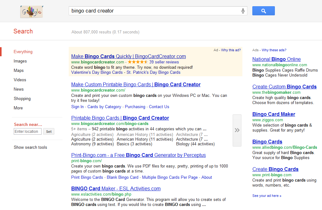
That’s why if you buy ads on Google itself, they’ll look something like this:
As you can see, the top ad is styled to resemble the main content on the page, with a bit of a subtle yellow background and the notation that it is an ad there, if you take a gander for it. (Note that a lot of users think that yellow is used for marking the best results. Non-technical customers, yay. If you don’t believe me, watch someone who can’t program Google sometime.)
I buy a lot of ads on the Google Content Network, but I don’t get a say in how they are presented usually. Since I pay per click, it is in the interests of webmasters to make the ads look content-esque, so that they catch lots of clicks. They occasionally get clicks with less-than-true-user-intent volition behind them, but that is a cost of doing business for me.
Anyhow, I’m always experimenting with different ways to advertise profitably for my businesses other than Google AdWords, which a) are expensive (I spend something like 50~60% of my gross on a sale at the margin) and b) have limited volume. I recently was inspired to try something new when listening to a (paid) Mixergy video with Ilya of Mixrank, whose blog you should really be reading if you are interested in online advertising. The gist of the video was to try negotiating direct deals with advertisers with access to the right targeted demographics, and I’m going down that route as well, but for the moment I wanted a get-my-feet-wet option that was more self-service, so I went with BuySellAds.
BuySellAds basically lets you pick a website (in their network), pick a particular type of image ad inventory on it, and pay the displayed rate for advertising there for a month. Sadly, their options for inventory appropriate to teachers are rather lacking, but I found one wonderful website accepting ad placements through them: BusyTeacher. BusyTeacher takes 728×90 image ads on their category pages, like this one. So I went into Paint.NET to exercise my meager pixel-pushing skills, slapped something together, and submitted it for their approval. After they approved the ad, my credit card got charged for a month of placement ($135 for an estimated 500k impressions or thereabouts), and it went live.
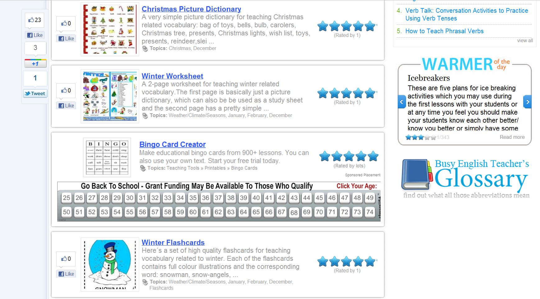
Let’s Play “Spot That Ad”
You can click on the photo to see the full size version.
You probably saw-but-didn’t-see the “Get A College Degree For Easy Loan Payments of Only…” spammy ad in the middle. If you routinely surf sites visited by middle-aged women, you’ve seen-but-not-seen so many thousands of them that you tune them out. But you probably didn’t automatically tune out the Bingo Card Creator ad.
Spot it yet? Hint: it’s the row without the Facebook button.
Is This Evil Or Just Evil Genius?
Once upon a time I was an engineer totally scornful of effective marketing, but I have gradually gotten over it. After thinking it over, this is aggressive but within my comfort envelope. The ad is honest about being an ad, makes a straightforward commercial proposition (“Sign up for a free trial”) to an audience that I think will respond well to that, and is pretty true by the standards of marketing copy. It is designed to catch clicks only from people interested in signing up for a free trial of Bingo Card Creator, and sends them straight to a landing page where they can do just that.
I wish there was a way to dynamically generate the image such that I could provide a more exact star valuation, but in the context of a sponsored placement, “Rated 5 stars by lots” is both non-specific and true. Lots of people have used BCC, and when I ask for star ratings in internal surveys I get something like 4.8 on a volume of hundreds or thousands. I think this compares favorably with “9 out of 10 dentists agree” and other pretty banal marketing copy.
So Does It Work?
Oh heeeeeeeck yes. That ad has a 2.2% click through rate (astronomical by the standards of banner advertising), generates about 500 views of my landing page a day, and of that about 11% or so convert to the free trial. (This is lower than my landing page average by quite a bit, but that makes sense. Most people who come to one of my landing pages just got done searching for e.g. “make bingo cards”, so they’re clearly in a bingo mood. The user here was just looking at a page about generic teaching activities then shown the bingo option, and might not be totally sold on bingo for her classroom yet.)
Anyhow, at about $5 to run on this site per day, the CPA (cost per action = how much money do I spend per free trial signup driven) has been running somewhere in the 8 cent region. Yowza. I pay Google closer to 30 ~ 40 cents. At typical conversion rates to a trial of about 1.8~2%, that means that this costs me $4 or so to generate a $30 sale rather than $20. Sold!
I just wish there was more inventory available. Many of the sites in the teaching niche either only do Google AdWords, so I’m already saturating them (and paying a cut to Google), or they only accept advertising through large networks, which tend to favor e.g. brands with $X00k marketing spends and not guys who want to experiment with a few hundred bucks at a time. I’m following up on the advice to get in touch with smaller sites directly, but I need to hit the sweet spot of “Small enough for my $X00 to matter, large enough that they send me enough traffic such that my time in negotiating an ad buy and preparing a creative is worthwhile.” For an experiment that looks like it will net in the neighborhood of $1,000 a month in sales for $135 and ~10 minutes of pixel pushing, this one is going in the win column. I hope to get bigger and better results later.
Anyhow, check out BuySellAds, direct ad buys, and ad blending. They can be made to work.


