My oldest software product, Bingo Card Creator, is currently in maintenance mode. For the last year and change, I’ve done very little to actively improve or market it — I just send emails, cut checks, and collect profits. That was pretty much the plan for this year, too.
Then, I got an email out of the blue from Ashraful Sheik, a designer who had seen a years-old HN post by me about my design needs and wanted to see if I needed any work done. I don’t usually rush to employ people who send me unsolicited emails, but I’m always happy to read emails, so I took a glance at his portfolio in case I could recommend him the next time one of my clients needed a designer.
I noticed that he had previously done a design for VLC Player. It’s software that does… actually, I’m not really sure what it does, but I remember it from an HN thread waaaay back about them having SEO problems, and the reason I remember it was because I really liked their website design. Simple, elegant, modern… and very much not what Bingo Card Creator looked like. So I mulled it over for a few minutes, figured I had a few days free in April, and asked Ashraful for a quote for a full-blown redesign of BCC. I thought I’d try A/B testing it against the existing site.
Technical Sidenote: Why I Never Do Big-Bang A/B Tests
People have often asked me why I’ve never tested full redesigns before, and the answer is always “They’re a metric tonne of work to do correctly.” You might naively assume that you just create two versions of your application’s template and, bingo, the money starts rolling in, but it is never that simple for non-trivial applications.
If you only have one site-wide template and you are totally religious about not including presentational code in any view/template/partial and the before and after redesigns are very compatible at the DOM level, then doing the A/B test isn’t that bad. This was very much not the case for BCC and will likely not be the case for most live applications.
I actually considered making a complete copy of the BCC application with a shared database, then doing the split testing with some sort of software load balancer redirecting people to two entirely separate Rails stacks, but that promised to be a whole heck of a lot of maintenance pain going forward in return for avoiding coding pain for the integration. So having nixed that idea, I did some plumbing in the Rails 2.3 internals to override how Rails magically picks layouts. This let me make duplicates of my existing layout structure for the redesign, do the appropriate HTML changes to them, and then start worrying about the main content areas of the layouts (where the real work began).
#goes in application_controller.rb
#Hack hack HACKEY HACK to re-direct all layouts to /layouts/redesign if this user is in that A/B test.
alias_method :old_active_layout, :active_layout

def active_layout(passed_layout = nil, options = {})

  redesign_choice = session[:big_bang_redesign] || ab_test("big_bang_redesign", ["default", "redesign"], :conversion => "purchase")
  # Exclude abingo controller and one blog article from scope of redesign -- customers don't see them and they'd take real work to get right.
  @use_redesign = (redesign_choice == "redesign" &&(params[:controller] != "abingo") && (params[:action] != "developing_shopping_cart"))
  unless (@use_redesign)
    old_active_layout(passed_layout, options)
  else
  layout_name = old_active_layout(passed_layout, options).to_s rescue nil
  return nil if layout_name.nil?
  chosen_layout = "layouts/redesign/#{layout_name.gsub("layouts/", "").gsub("redesign/", "")}"
  find_layout(chosen_layout, default_template_format, options[:html_fallback]) if chosen_layout
end
Ahh, DOM conflicts. One of my requirements for the new redesign, to save my sanity, was that it be built on a grid system. I picked 960.gs because I happen to like it, but Bootstrap would have worked just as well. BCC is presently written without the benefit of a grid system, so the internals of many pages require a bit of tweaking to fit onto one. Also, the redesign omits elements of the previous design in some places in such a way that “display:none” doesn’t really cut it, so I wanted to be able to quickly turn off and on bits of HTML based on whether someone was using the redesign or not. I made a quick helper to do so: redesign(true) { # renders only if someone is seeing the redesign}, redesign(false) { #renders only if someone is seeing the old version}.
def redesign(for_redesign = true, &block)
    test_choice = session[:big_bang_redesign] || ab_test("big_bang_redesign", ["default", "redesign"], :conversion => "purchase")
    # Exclude abingo controller and one blog article from scope of redesign -- customers don't see them and they'd take real work to get right.
    @use_redesign = (test_choice == "redesign" && (params[:controller] != "abingo") && (params[:action] != "developing_shopping_cart"))
    #If for_redesign and use_redesign are both truth or both false, yield.
    if (!(for_redesign ^ @use_redesign))
      yield
    end
  end
This let me start attacking the marketing site and application for Bingo Card Creator, adding code-spackle where required to get things actually working correctly. It turned out to be necessary in 60 places, consuming most of the three days it took to get the redesign working after receiving the HTML and CSS mockups for it.
The final technical measure was for user experience: anyone who has ever done a redesign knows that a vocal contingent of users hates them. As long as I was doing an A/B test anyhow, I gave users the ability to flip between which version they were seeing, buried waaaaaaaaay at the bottom of the page in the footer. This way when people complained (and two inevitably did) I could tell them how to opt-out of the new version. (It is also indispensable when testing to see that the site was functional in both versions.) Feel free to use this feature if you want to see both versions of the site live.
Enough Technical Mumbo-Jumbo, Let’s See Some Screenshots
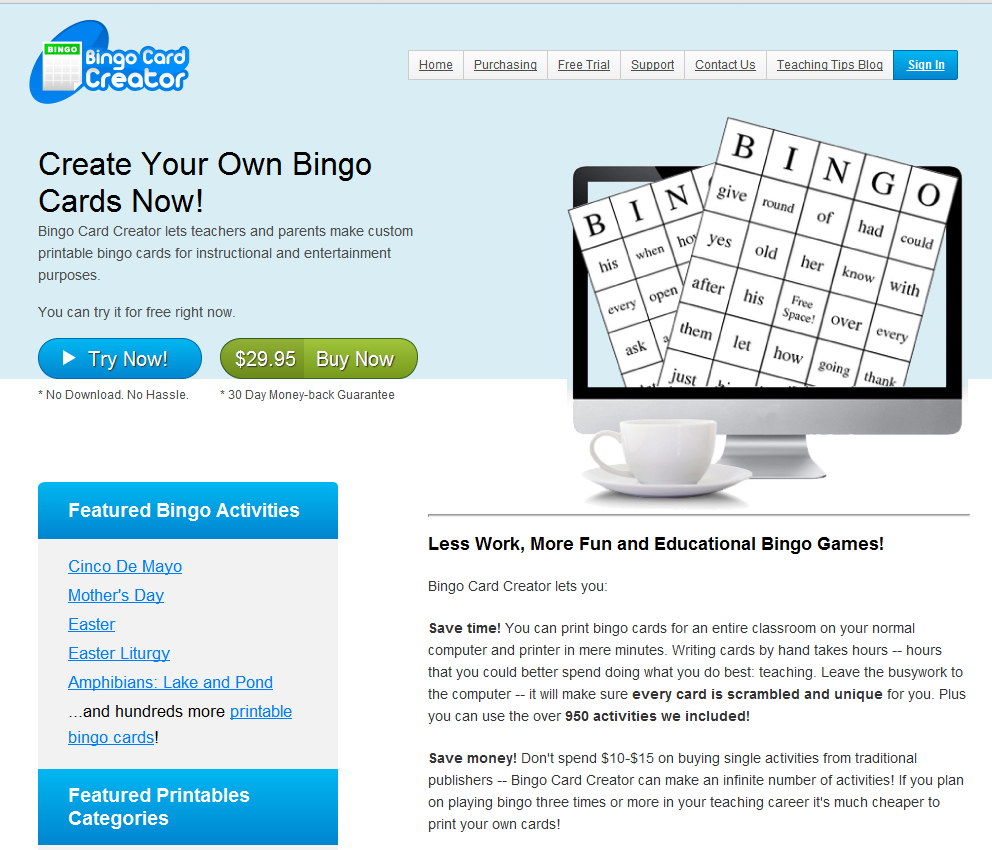
The old version of the home page:
The new version:
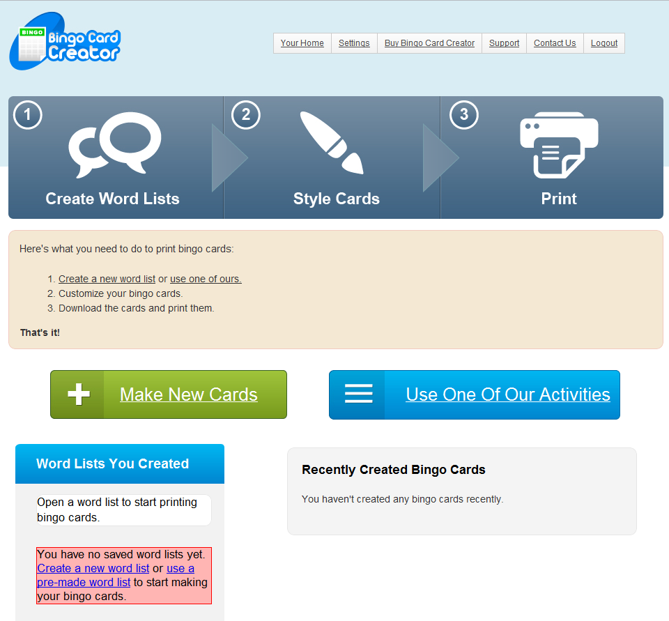
As you can see, the new version is cleaner, more modern, and (partially as a consequence of finally adapting to a world with wider displays than 800×600) has quite a bit more room to breathe between elements. It probably still won’t get featured in any design galleries, but that isn’t the point: this site exists to sell software. (I rush to add that this isn’t a reflection on my designer’s skill: my brief constrained him into favoring the commercial imperative over design imperatives in a few ways. As always I’m ultimately responsible for anything which looks bad and the designer gets the credit for anything that doesn’t, since if I were left alone to design things they’d look like big balls of blue-green mud with large orange BUY NOW buttons stuck in them.)
Redesigning The UX of The App
As long as we were giving the site a facelift, I decided to see if without majorly tweaking the underlying application we could make it more usable. I thought of adding a prominent graphical element suggesting what steps it requires to make bingo cards and tracking user progress, something which has been reported to work frequently among UX folk. (I also have a motivational result or three from clients about this.)
This is what a new trial user previously saw:
Here’s what they see now:
I added a few affordances to that design. For example, clicking on the elements of the progress bar makes my best context-based guess of how to move you backward or forward along the path of making bingo cards. It also highlights showing you how far you’ve gone, as seen here:
You’ll note that I haven’t fixed the Next Step button yet. Ahh well, always one more thing to do…
So How Did Things Go?
I generally do far less extensive A/B tests than this, and track them only to a single conversion. (That is actually a limitation of my A/B testing software, A/Bingo, because I never really saw the need before to track a change’s effect on multiple conversions in my own business.)
However, since this redesign affects every part of my funnel from the AdWords landing pages to the internals of the application to the purchasing page, I thought it might reasonably be the case that the redesign was a win somewhere and a loss elsewhere, so just tracking to the final conversion (purchase) might cause me to have an incomplete view of the implications of the redesign.
Enter KissMetrics, my current favorite funnel tracking software. They’re wonderful, you should use them. I’ve happily paid $150 a month for the last year or so and barely log in — that is totally justified now.
KissMetrics lets you include custom properties as people cause events in your site/app/etc (which you can then retrospectively organize into funnels on their website). I simply included which version of the site someone was seeing as a custom property, then fiddled with their UI a bit until I had the filters set properly, and voila, I can now see the A/B test affect every funnel I have.
In some cases, the redesign was a win.
AdWords Landing Pages: Did Registrations Go Up?
Consider the AdWords landing pages, where I measure conversion to the free trial (all stats taken from last 7 days just for convenience, but they mostly match results since start of test):
| old version | Visits: 1,403 | Conversions: 293 (20.9%) | |
| redesign | Visits: 1,349 | Conversions: 311 (23.1%) |
I’ll spare you the z-test: That modest increase is statistically significant at the 10% confidence level, but not at the 5%. So middling evidence of a change in the right direction. So far, so good.
It was actually a much more dramatic increase on my non-AdWords landing pages (SEO-ified content, you’ve heard me talk about it before), but that pales next to the following improvement.
The Application: Did User Success Increase?
I’ve written and presented previously about using funnel tracking to improve your application such that users are more likely to succeed with it. Success with Bingo Card Creator involves, predictably, actually creating bingo cards. Somewhat surprisingly, back when I started tracking it, only 48% of free trials actually got as far as actually successfully downloading a bingo card. I’ve worked on that and gotten the number to 60% over the years — roughly a 25% lift in user success with a huge, honking increase in my bottom line results as a consequence. My consistent experience has been that the more users succeed with BCC, the more money I make.
So if we look at the workflow for BCC:
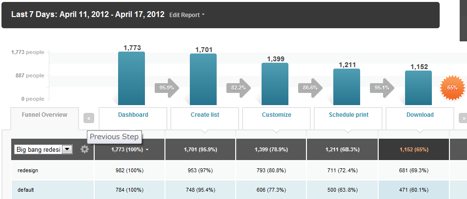
I had to stitch that together from a pair of screenshots because it won’t fit on one interface in KissMetrics, but the numbers are accurate. Let me direct your attention to the salient bits:
- The redesign has a lot more people start at the Dashboard than the “default” (old) version does. This is because the redesign is, as we previously discussed, crushing the old version at getting user signups to the free trial.
- Each step of the funnel includes a percentage, which is the percent of the folks who started at Dashboard that made it all the way through that step. (They’re not inter-step percentages, they’re cumulative.) If you want to back out the math, you’ll see that the redesign outperforms the drop-off rate of the old site at every step in the funnel — 1% here, 2% here, 5% here.
- This compounds multiplicatively. By the end of the funnel, the redesign has a 9.2% increase (a 15% lift) in user success compared with the old version of the software. To give you some appreciation of that: if you’re working with mature software and have already grabbed your low hanging fruit, the magnitude of that improvement is staggering. That is literally better than a year’s worth of active tweaking at this point.
- When you compound the pre-workflow increase in trial signups and the increase in user success, the actual number of teachers who successfully create bingo cards out of a given number sent to my site in the first place goes up by 45%. This makes this the most successful A/B test I’ve ever run, at least by that metric.
Egads, So This Printed Money For You, Right?
Cue the bad news! Teachers are so successful with the newly redesigned BCC that, out of any 100 using the software, less of them decide to purchase it. This almost exactly cancels out gains in trial registrations and user success. It is downright painful: last week, I got 26 sales, and would you believe they were split exactly 13/13? That’s practically a textbook null result — it was so improbable to me that I spent a few hours checking stats to see if I hadn’t made a systematic error somewhere, but no, crosschecking in a few places makes it look legitimate. (The split since I started the test is 50/46 in favor of the old version, which is comfortably in the null result territory as well.)
Does that result sound counterintuitive to you? It is the sort of thing that, when I have to report it to clients, always sets me walking on eggshells. The first rule of A/B testing is that everything you know is wrong.
Since I have the luxury of well-instrumented funnels, I can tell you where the problem isn’t:
We did a complete redesign of the purchasing page and shopping cart. I omitted showing it above to save space, but I’m pretty proud of how it turned out . The new purchasing page/shopping cart is not the problem: precisely as many people will, once getting to the purchasing page, complete a purchase as they would previously. (On the subject of plumbing-that-takes-money: Stripe. I’ve promised them a case study post someday, but the capsule version is that if you can use Stripe you shouldn’t be using anything else.)
The problem appears to be, simply, that less users hit our trial limitations now. (Hitting the 15 card trial limit is the overwhelming cause of going to the purchasing page.) This suggests that either a) the new site is converting more parents than the old one used to, and since parents rarely have 15 children they’re simply having a happy bingo experience and not paying (net win for the world, not really a win for me personally though) or b) for indefatigable reasons, users simply get what they need out of the free trial and don’t convert. It is entirely possible that any of the sixty small tweaks I had to make to the site nudged people away from hitting those limitations.
This is one of the reasons I hate big-bang A/B tests — when you have a huge batch like that, isolating the exact cause of any observed effect is difficult (other than “Well, clearly, something changed in the redesign”), whereas A/B testing an individual element structurally gives you configurable levels of confidence that a particular element was the one and only cause of an observed effect if the stats shake out that way.
So Where Does That Leave You?
If I had a great desire to do more work in BCC, this would provide a good place to target. I could figure out why the new version of the site is having less folks hit trial limitations, and either tighten those limitations or tweak the UX such that the site nudges more people into hitting them. That said, the free time on my schedule is rapidly drying up as we get closer to my wedding, and even if I had captured all of that 45% increase to the bottom line that isn’t really the path forward for my business, so BCC is going back into maintenance mode. This one is getting written off as an amusing and partially successful experiment which helped out my users but didn’t succeed at making me money. I will likely finalize the redesign and kill the old version in the coming weeks.
How did existing users respond to the change?
Well, half of them don’t know about it yet, obviously. With two exceptions, the feedback has been overwhelmingly positive. Many of them were appreciative that they got the Totally New Software Absolutely Free. It is actually functionally identical to the old version — not one line of model code or business logic changed — but I have received many compliments about the wonderful new features, performance increase, and improved compatibility with Epson printers. Before you laugh, consider that probably 95% of software businesses don’t A/B test yet, so my users are in good company making inferences from observed behavior changes over time even when their explanation for the changes has no relationship to reality whatsoever.
Sidenote: If new software is assumed to be worth money and reskins make software “new” in the minds of the only people that matter (users), that probably suggests a viable marketing strategy. Your engineers don’t have to like it.
How much did it cost you?
BCC is growing like a weed for reasons totally unrelated to my work on it (long story but you can see the recent stats). This means I have quite a bit of flexibility to cut checks to make things happen. To give you a rough idea, we settled on a price of $1,X00 for PSD, HTML, and CSS mockups of my front page, my pricing page (complete with minor JS for the shopping cart), and the main page of the application. I then munged that into site- and application-wide templates to get things to their current state.
Ashraful was wonderful to work with: very responsive to email, timely, and receptive to feedback in a way that improved the quality of the designs vis-a-vis my target market while also decreasing the amount of integration work I had to do. I’d work with him again in a heartbeat. You should hire him.


