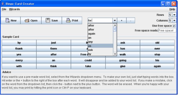
I posted earlier this week about how I took advantage of icons-icons’s August sale to get a pile of stock icons for $29.95. I just wanted to post why I’m thrilled with my purchase. Here are two screenshots from my program. The first is version 1.03, which is the newest version which is officially available. The second is a sneak peek of version 1.04, which I hope to have out sometime next week. This is the screenshot which directly sells my program more than any other (with the possible exception of the printed output scan): its my interface looking at its best and brightest and it hints to the teachers exactly how much use they can get out of my program. Accordingly, its placed prominently on my website (above the fold on my main page).
Here’s the old version (click to enlarge):
And here’s the new version (thumbnail):
Now doesn’t that look more colorful and vibrant?
Incidentally, the change to whites in the card preview is a side-effect of changing that to more accurately reflect what things will look like when they are printed. I hope to have a Print Preview feature ready for 1.04’s actual release, but will keep that interface element because it makes my program look more substantial and because it greatly simplifies the workflow if you’re making your own word list.


