(All images in this post are cut off by WordPress. Click to see the full versions. I suggest opening them in a new window.)
I have been using CrazyEgg for the past week or so, trying to make some usability changes to increase the conversion of my website. I was skeptical that it was going to provide better information than Google Analytics, because Google Analytics also has a site overlay feature, and because I had been using Analytics for months and presumably was getting all or nearly all I could out of it. The test has showed me several places where my website was broken where I thought it was working perfectly, and as a result I’m going to dig out my credit card and sign up for CrazyEgg as soon as I get done writing this post.
Here’s a comparison of two views of my website over the same interval. The first is Google Analytics, the second is CrazyEgg. Focus your attention, like I do, on how well this page drives people to the free trial.
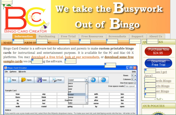
Here is what I see when I look at this image: the website appears to be functioning well. The most popular link on the page is the blue Download Free Trial button, which is exactly what I want. Screenshots also appear to be pretty popular. One concern is that folks seem to be banging on the Information tab a lot, which will take them directly to this page, so its clear they don’t quite understand the highlighted tab metaphor (not suprising given my audience). The three links in the first paragraph of text are performing moderately well and primarily directing people to the trial, which is exactly what I want (screenshots and free information are nice to the extent people download as a result of them).
It turns out that these conclusions are faulty. Lets see this page again, in a CrazyEgg heatmap.
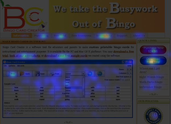
What do we learn here? Well, first, no one is banging on Information — thats just a quirk of the Urchin (Analytics) script on some browsers when people double-click to open a link instead of single click. The download a free trial link in the first paragraph went totally ignored (not one click out of two thousand visitors!) while the screenshots and free bingo cards got much more significant attention than you would have thought from looking at Analytics. The bright blue Download a Free Trial button performs admirably. The screenshot in the middle performs extraordinarily well — almost 33% of visitors to the page will at least click it to see what it looks like! This was catastrophically bad news for me when I heard it, since I know that clicking a screenshot is the quickest way to bounce a prospect, since so many of my visitors have limited web-navigation-fu.
So, here’s what using CrazyEgg to enhance my borked understanding of the Analytics numbers let me do:
a) I installed Lightbox, and watched my bounce rate drop considerably. Not only does it look stylish, the “click anywhere to go back to what you were doing” mechanism works very well for technically unsophisticated customers. (More evidence of this: take a look at how many people are banging on the New button in my screenshot. Yeah. Believe it or not, I’ve gotten emails about that before — “The New button doesn’t work.”.)
b) I am going to redo the first paragraph of text to deemphasize “download” and emphasize that you can “create free bingo cards” using the trial download. I may end up burying the free bingo card link in the free resources section, since its far too effective at siphoning people off where it is right now.
c) You can’t see it from these two photos, but I also did tests of my purchasing page and download page. Whoa doctor, are there some easy and obvious things to change.
Incidentally, if you’re wondering “Why does Crazyegg report different data than Analytics?”, the answer is that CrazyEgg tracks clicks on a per-coordinate basis and Analytics tracks them on a per-URL basis. To override that, you have to go to considerable work when coding your webpage. This means that Analytics treats that blue button and the first paragraph “download the free trial” link as the same place, so it munges their stats together when displaying them, which makes it not-obvious that the Big Blue Button is an awesome success and that the first paragraph text link is a crushing failure. I had previously gone to a heck of a lot of work when I redid my purchasing page to make sure that every link was hooked up correctly, and I ended up having so much information flowing at me in the statistical summary I could not make heads or tails out of it. The heatmap, on the other hand, tells the story in a really efficient manner: “Customers want to ‘Pay with their credit card’ and need to be guided on to what to click on to make that happen”.
Given that CrazyEgg is dirt cheap ($9 a month), I’d be … crazy… if I didn’t sign up for it. All I would need to do is decrease my bounce rates anywhere in the funnel by about 1-5% and it would pay for itself. I think I’ve already accomplished that several times over. I’m obviously not going to stop using Analytics, because I do need the big heaping helping of stats (especially referrers and search queries) and the view on how people move through the pages as opposed to what they do at each individual page, but CrazyEgg provides an easily understandable visualization of the things I need to focus on — what my customers are focusing on, naturally.
(Edit: it took some work to make the pictures fit.)