Now that Easter is over and the accompanying surge and then dearth of traffic has passed I thought I would get cracking on the graphical twiddling.
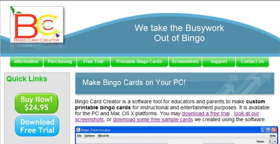
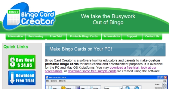
The site, as it looked five minutes ago:

The site, as it looks now:

There are also buttons in matching styles on the card download pages. You can see it on the page about, say, a set of bingo cards about Japanese customs.
This set of logos is all done by Logo Samurai, including the header (with integration work by Gursimran). Since it is technically difficult to split test the header on my current setup I’m going to have to sort of fudge it (i.e. look at the metrics for the next two weeks and see if it causes major changes or not). Not the world’s best experimental design but oh well…
My little brother, with the blog set up to sell his eventually-going-to-be-published superhero novel, has started some pretty hard-core-for-a-college-student optimizations to make his writing more sticky. This post is probably of genuine interest to uISVs, as it involves changes in header art which essentially make the blog’s USP (Unique Selling Proposition) more comprehensible and the blog connect better to the target readership. This has apparently caused about 25% more readers to stick around and actually keep reading when they’re drawn into his copious linkbaiting efforts.
I have the good fortune to be on a fast, fast, fast Japanese connection and as a result don’t typically wait too long to view webpages. This makes me forget sometimes that the rest of the world doesn’t get nigh-instantaneous page loads, which means I don’t often design with this factor in mind. However, somebody pointed out that the new sidebar buttons were loading last for them, and as my front page can potentially take 4 seconds to load (longer than a significant portion of visitors stay!) I didn’t want that.


