Recently on the Business of Software forums I gave someone advice regarding web design. (I seriously, seriously envy his design prowess — the website for his VST host software is one of the best I have ever seen for a microISV.) One issue I identified with his site was that at some points it lacked clear direction as to what to do next.
On reflection, there is a gaping hole in my own site design for this: the big screenshot on the front page. It is ginormous and consistently picks up over 10% of the clicks on the page. Clicking on it currently brings up a maximized version of the screenshot in a lightbox. The lightbox is a wonderful effect, but what is the user supposed to do with the maximized version?
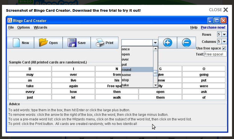
Well, ideally, they’re supposed to close that screenshot, then find the Free Trial or Try Online buttons and download. Blech! That is two more clicks, bringing to three the total of clicks they have made to my page! Clearly, there is an opportunity to eliminate a click. All I need to do is bring the buttons to them, in the constrained environment of the lightbox. (I’ve always wanted to do this but didn’t have any convenient way to do it with my previous lightbox technology, and never got around to doing it after moving to a less constrained lightbox script.)

I have pushed the new and improved version of the page live. If this post was published recently, you can see the old version here. For obvious usability wins like this one, I’m not going to bother A/B testing prior to pushing it live. (Plus I have a lot on my plate tomorrow in terms of non-obvious things, and running multivariate testing scares me.)