I spent a day with my designer today and came up with the following. The old registration page:
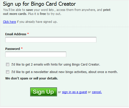 It empirically works (fairly well, actually) but it is spartan. (The design is actually a slightly hacked version of the CSS which I downloaded from my Wufoo account — with their permission, naturally. Yay for Creative Commons. I don’t actually use Wufoo for storing any data but I love the form designer and pay $10 a month just to access it.)
The new, redesigned hotness:
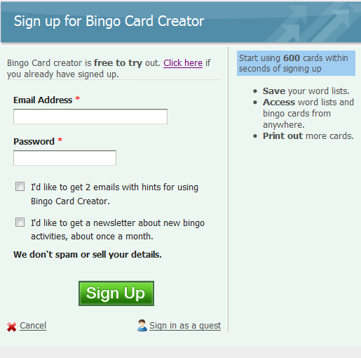
I like this because it is more visually engaging and contains the sidebar, which I can stuff full of reasons they should sign up without impacting the readability of the main form. It is also much more “on brand” for Bingo Card Creator, with the presence of my trademark (well, not really) H1 tag.
We’ll see which one ends up converting better.
While I was at it, I decided to try making the experience better for users coming in from my mini-sites. Remember how I have a Halloween bingo page? You might want to open that for a second. The transition from that page to my site was sort of jarring — you move over domains, which normal users could care less about, but you also move from a black and orange color scheme to my soothing pastel blues. Even with the guide text on the new page about Halloween bingo cards, I was worried about losing the “scent” — having a user figure “Whoops, this isn’t getting me to what I wanted” and closing out prior to signing up.
Accordingly, I did a bit of work to my template to automatically name the H1 with the card’s class, and all I have to do is upload a header image and write a wee bit of CSS and, presto-changeo:
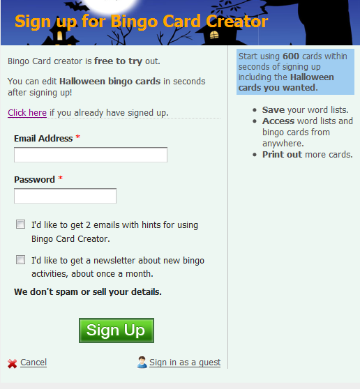
Now it is much more obvious that I’m offering Halloween bingo, as promised.