Periodically, news of an innovative, goofy, compelling, or compellingly goofy design decision will sweep across the Internets like wildfire. Most recently, this happened with a madlibs-looking lead generation form.
I think it has much to recommend it in the context of lead generation forms (long, arduous monstrosity that you sign up for in the hopes you are contacted but not spammed to death), but I didn’t see much possible upside for using it on a new user registration form (short form which you sign up to use something).
However, I’m wary of trusting my instincts on such things when I could trust data instead. There is a key point about A/B testing: trust your data, not somebody else’s data. After all, you only make money when it improves your conversion rate, not their conversion rate. You can feel free to use other folk’s successful experiments for inspiration but for heaven’s sake use them to inspire you to run tests, rather than inspire you to fire blindly.
I was particularly wary about trusting this result because, as pointed out by numerous people in the Hacker News discussion, roughly seven things changed between the two forms in the A/B test performed on the standard form versus the madlib form, and there is no particular reason to assume that the salient difference was caused by the part which strikes us as creative as opposed by more boring things like e.g. the call to action in the header.
When In Doubt, Test. (When Not In Doubt, Test Twice.)
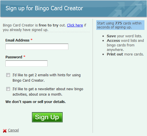
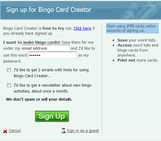
No less than six people said “Hey Patrick have you seen this madlibs thing yet? You’ve got to try it.”, and because knocking something together would take less than 10 minutes because I have an A/B testing framework that makes this a one-line proposition, I decided I’d humor them. I isolated just the madlibs versus standard style for the test, knocked up an alternative in about ten minutes with my (decidedly limited) CSS and Javascript skills, and set them against each other. My conversion goal for this test is successfully inducing someone to sign up for the free trial of Bingo Card Creator.
My Usual Registration Form
The Madlibs Registration Form
P.S. If you have good eyes you’ll spot the other A/B test ongoing on this page. I’m using the traditional way of mitigating cross-test interaction… ignoring the possibility of it. Don’t tell your college stats professor, but this actually works pretty well in practice.
Results
I ran this test until A/Bingo, my A/B testing framework for Rails, told me that further testing was just a waste of my time. It didn’t take long at all — 34 hours after the test alternative went live for the site, the first time I checked the results, they were already overwhelming. Let me copy/paste right off my public results page:
| Signup Madlibs Versus Standard |
Standard (27.55%) winner Madlibs (21.73%) |
95% |
By my count that is a 22% decrease in conversion rates for using the madlibs signup style over the standard signups style, and the fact of the decrease (but not the magnitude) is significant at the 95% confidence level.
For the curious: there were 736 participants in this test, split roughly 50/50, as you would expect. I love the Internet because where else can you get 736 people to help you improve your website while you sleep, work at the day job on Saturday, have an evening out with friends, and then sleep some more?
Anyhow: test ended, not touching the madlibs idea again. Before adopting this or any other fad (or good suggestion, for that matter): do your own A/B tests.